
Project overview
Distro is an on-demand delivery service — similar to Chowdeck and Glovo — that connects customers with a variety of businesses for fast, curated deliveries. The platform includes both a customer-facing app and a rider-facing app.
I was responsible for designing the rider mobile app over a 1-year period, focusing on solving the core pain points riders face daily: confusing navigation, poor GPS, cluttered interfaces, slow order acceptance, and lack of earnings transparency.
Target users: Delivery riders (gig economy workers)
Platform: Mobile app (iOS & Android)
Status: In development, not yet launched | Expected initial riders: 100
The problem
Through competitive analysis of existing delivery apps (Chowdeck, Glovo, Bolt Food, etc.), I identified five critical rider pain points:
| Problem | Impact on Riders |
|---|---|
| Confusing navigation | Missed turns, late deliveries, frustration |
| Poor GPS accuracy | Wrong addresses, wasted time, reduced earnings |
| Cluttered interfaces | Missed order notifications, accidental taps |
| Slow order acceptance | Lost earning opportunities |
| No earnings transparency | Distrust, inability to track daily income |
My Role & Team
My role: UX/UI Designer ( I was the sole designer for rider app)
Team structure:
- 3 Designers (I focused only on rider app)
- 3 Developers
- 1 Project Manager
What I did:
- Competitive analysis
- Journey mapping
- Interactive prototypes
- UI design for all rider features
- Self-directed design decisions
Design Process
Because this was a fast-paced project, I adapted my process to be lean and focused:
| Step | What I Did |
|---|---|
| 1. Competitive Analysis | Studied rider pain points in existing apps (Chowdeck, Glovo, Bolt Food) |
| 2. Journey Mapping | Mapped the rider’s end-to-end workflow |
| 3. Interactive Prototypes | Built clickable prototypes to simulate key flows |
| 4. UI Design | Designed clean, simple, task-focused screens |
Rider Persona (Proxy)
Based on competitive analysis and the target market context, I developed this representative persona:
Name: Tunde
Age: 28
Occupation: Full-time delivery rider
Device: Budget Android smartphone (intermittent data connection)
Goals:
- Accept orders quickly without confusion
- Navigate to pickups and drop-offs reliably
- Complete deliveries and see earnings immediately
- Spend as little time in the app as possible per order
Pain points (from competitor analysis):
- Too many taps to accept an order
- GPS sends him to wrong locations
- Can’t find earnings summary at end of day
- Cluttered screens cause mis-taps while riding
Quote: “I don’t have time to figure out an app. I just need to pick up, deliver, and get paid.”
Rider Journey Map (Proxy)
I mapped the rider’s end-to-end journey to identify friction points:
| Stage | Rider Action | Pain Point (Competitors) | Distro Solution |
|---|---|---|---|
| 1. Go online | Toggle availability | Hard to find toggle | Prominent online/offline switch |
| 2. Receive order | Get notification | Slow to load, small tap target | Large notification card, one-tap accept |
| 3. Navigate to pickup | Follow GPS | Poor accuracy, confusing turns | Clean map view with clear turn instructions |
| 4. Confirm pickup | Mark as picked up | Buried in menu | Single prominent button |
| 5. Navigate to drop-off | Follow GPS to the customer. | Same navigation issues | Same clean map experience |
| 6. Confirm delivery | Complete order | Multiple confirmation steps | One-tap complete with photo option |
| 7. View earnings | Check the payout. | Hidden, delayed updates | Real-time earnings tracker on home screen |
Key Features I Designed
| Feature | Purpose |
|---|---|
| Order acceptance / notification screen | Large, easy-to-tap notification with order details |
| GPS navigation / route view | Clean map with turn-by-turn instructions |
| Pickup and delivery confirmation flow | Minimal taps to confirm each stage |
| Earnings / payout tracker | Real-time visibility into daily and weekly earnings |
| Order history | Past deliveries with timestamps and payout |
| Availability toggle (online/offline) | Prominent switch to control order flow |
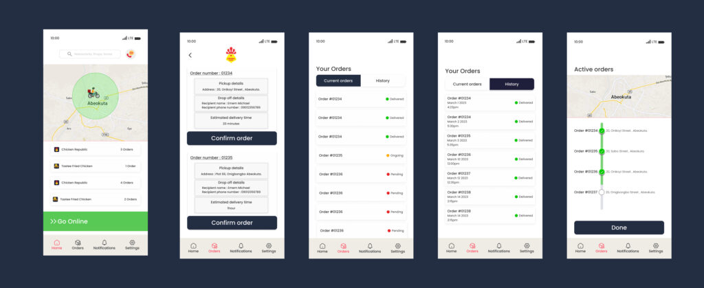
Key Screens
Design decision: Large tap target, clear order details (restaurant, customer, distance, estimated payout), minimal text to enable quick decisions while riding.
GPS Navigation / Route View
Design decision: Clean map with prominent turn instructions, ETA, and remaining distance. Avoided cluttered overlays common in competitor apps.
Pickup & Delivery Confirmation Flow
Design decision: Single, large confirmation buttons at each stage. No multi-step menus. Designed for one-handed use while holding a phone or package.
Earnings / Payout Tracker
Design decision: Real-time earnings visible from home screen. Daily, weekly, and monthly summaries. No hidden menus — riders see exactly what they’ve earned.
Order History
Design decision: Simple list of past deliveries with timestamps, locations, and payout amounts. Helps riders track work and identify peak earning times.
Availability Toggle
Design decision: Prominent switch at the top of the screen. Clear visual state (green for online, gray for offline). No digging into settings.
Design Principles
Based on my research and the target market context, I established three core principles for the Distro Rider app:
| Principle | Application |
|---|---|
| Simplicity first | Every task must be completable in 2 taps or less |
| Glanceable information | Riders can’t read paragraphs—use icons, numbers, and large text |
| Earnings transparency | Show payout immediately—no delayed calculations |
Outcomes & Impact
| Metric | Result |
|---|---|
| Launch status | Not yet launched (in development) |
| Expected initial riders | 100 |
| Design efficiency | Completed rider app design independently over 1 year |
| Key problem solved | Simplified task completion for riders in a fast-paced, low-attention environment |
Project feedback (from PM and developers):
“The rider app design was clear and easy to implement. Minimal back-and-forth on requirements.”
Challenges & Learnings
Hardest design challenge
Working independently without supervision. Unlike larger projects with stakeholder feedback loops, I had to make all design decisions confidently on my own, while ensuring the app would actually work for real riders.
What I learned about designing for gig economy riders
The process has to be extremely simple, especially considering the society we were building this for. Riders may not have high-end devices, unlimited data, or the luxury of time to explore the app. Every second spent figuring out the interface is money lost. I made sure the process of completing a task — from order acceptance to delivery confirmation — was as simple and fast as possible.
What I would do differently
If I had more time or resources, I would conduct real rider interviews to validate my assumptions. Competitive analysis gave me a strong starting point, but nothing replaces talking to actual users in their environment.
Tools Used
- Figma (wireframes, prototypes, UI design)
- Figjam (journey mapping)
- Google Sheets (competitive analysis tracking)